Apple Carrier
Manage your talk, text and data plans, and learn real-time usage, hassle-free.
About
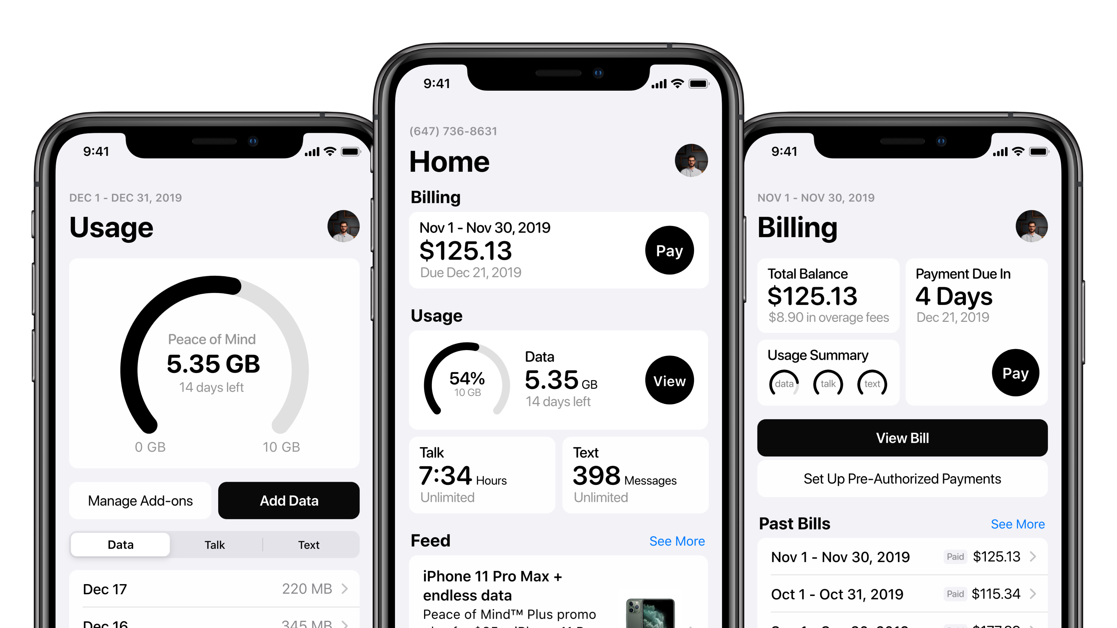
A minimum viable product concept for a native Apple app that helps users manage their mobile carrier plans, usage, billing, support, and account settings in one consistent experience. Instead of every carrier building and maintaining its own fragmented app, Apple Carrier imagines Apple as the trusted front-end layer connected to carrier back-end systems. The project explored how a centralized, Apple-designed experience could reduce carrier friction, improve transparency around usage and billing, and create a more seamless relationship between users, carriers, and the iPhone ecosystem.
View Case Study
This project was originally published on my Squarespace portfolio – view the PDF for the complete archive.
View PDFOther Work
Apple TV
Live Product
Stream movies, shows, and live sports across all your devices
Apple Sports
Live Product
Real-time scores and stats for your favorite teams
Apple Schoolwork
Live Product
Helping teachers organize, collaborate, and inspire
Apple Maps
Concept
A redesigned Apple Maps, focused on a more personalized experience.
Apple Carrier
● Concept
Manage your talk, text and data plans, and learn real-time usage, hassle-free.
Apple Authenticator
Concept
Enable a password-free future while keeping Apple users more secure than ever.