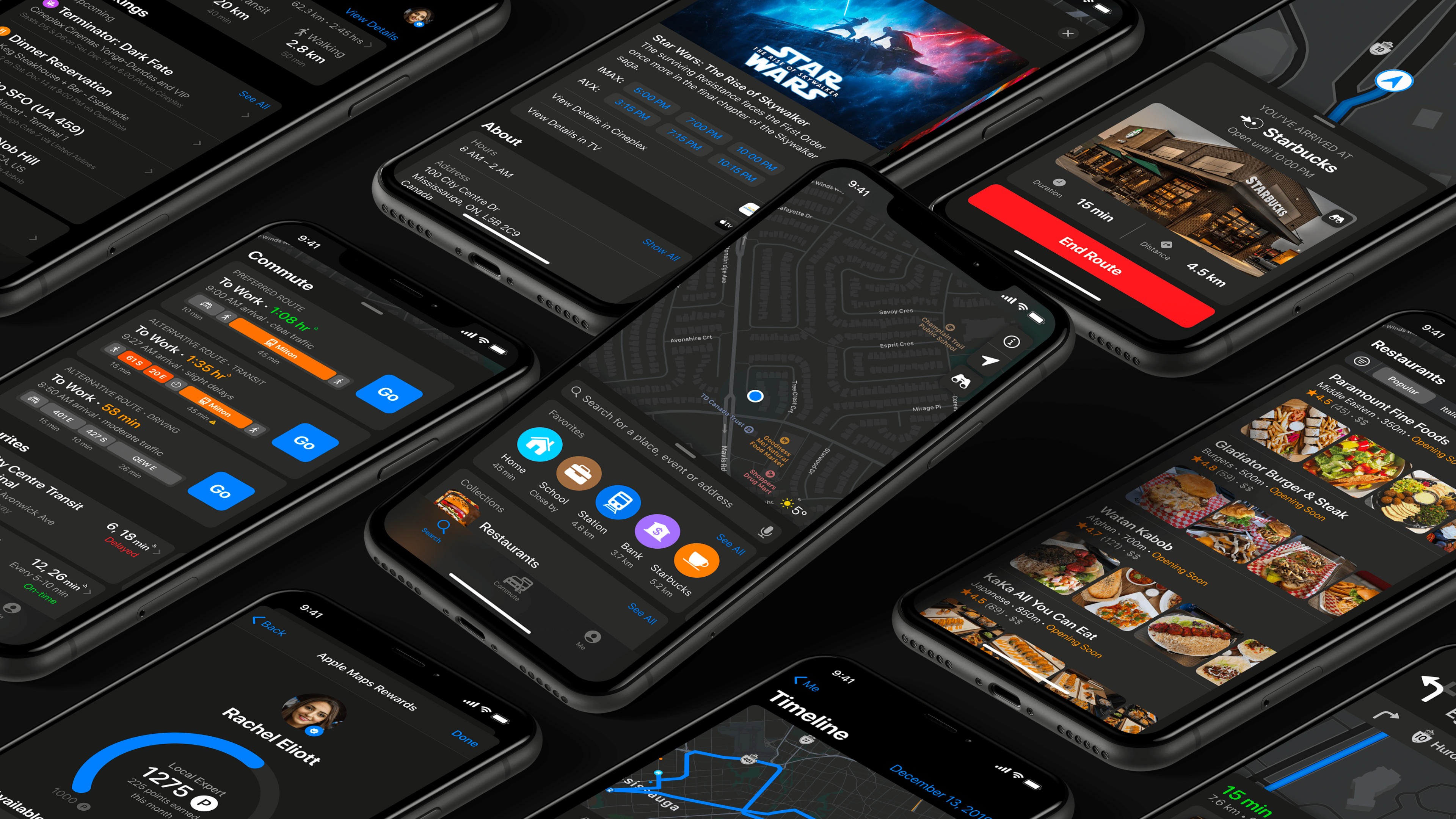
Back to Work
Apple Maps icon

Apple Maps

A redesigned Apple Maps experience; giving you the personal navigation system of your dreams

Role

UI Designer, UX Researcher, UX Designer

Team

Concept Project

Period

2019

iOS

About

A comprehensive redesign of Apple Maps with 40+ new features, giving you the personal navigation system of your dreams.


Overview

For over a billion Apple devices, Apple Maps is the default navigation app, yet is often ignored for competitors' apps (Google Maps, Waze, and more), because of their reliability, in-house review systems, robust features, and much more.

With iOS 13, Apple Maps received a massive facelift, with many exciting features, but it still lags behind its competitors in the industry. While Apple is building its Maps data from the ground-up, the company yet does not have an in-house reviewing system for business and places.

Research
Define
Ideate
Prototype
Test

Problem

Privacy Paradox

Users who value Apple's privacy stance are forced to use Google Maps for features like reviews and timeline

Limited Search

No ability to filter and sort through search results

Missing Features

No offline maps, timeline, or integrated search experience

Weak Integration

Relies on Yelp for reviews instead of an in-house system

Solution

In this case study, I have redesigned Apple Maps by looking into user feedback and requests. I added a ton of new features that could provide lots of value and save time – while also giving a facelift to the app in the effort of making the experience similar to other apps in the Apple ecosystem.

Core Feature Categories

The redesigned Apple Maps is focused on over ten functionalities:

  • Search – More powerful search with filtering and sorting

  • Directions – Schedule trips, multiple destinations, bike routes

  • Navigation – Color-coded traffic, in-app media, Siri Audio Mode

  • Commute – Multi-method travel, alternative routes, favorite transit lines

  • Places – Movie showtimes, in-house reviews, event details, delivery options

  • Me Tab – Timeline, Collections, Bookings, Offline Maps

  • Profile – Local Expert badge, rewards system, track reviews

  • Safety – Emergency SOS, automatic collision detection

Research

I read blog posts, comments, Apple subreddit threads, and competitor app reviews to gather research, and gain insight into the needs of users. I was able to better understand their stories, as well as their needs and pain points when using the app.

Understanding Apple's Design Language

To understand Apple's design guidelines, I read their official Human Interface Guidelines to understand the mechanics of it all on a much deeper level. One thing I learned was that Apple prefers to label things, rather than just putting an icon or symbol like Google Maps.

Competitive Analysis

Google Maps

Google Maps

Waze

Waze

Citymapper

Citymapper

Transit

Transit

Moovit

Moovit

HERE WeGo

HERE WeGo

Personas

Based on my research and competitive analysis, I developed three personas. Each persona demonstrates the type of users targeted for this app, as well as their individual goals, needs, wants, fears and tools that they use.

Persona - Heather
Persona - Jeff
Persona - Rachel

Information Architecture

Having an information architecture diagram was crucial for this project due to how much data is shown to users through an interface that looks very simple. To understand how every user can get to, and out of, a particular screen, I first designed a diagram based on the current Apple Maps and then added my new features and changes.

Loading diagram...

Apple Maps Information Architecture

Visual Design

While referring to the above research, personas, and sitemap, I studied all Apple-made apps to understand how to best layout new features. I then used the Apple iOS 13 Design Kit and began to design high-fidelity wireframes, using Apple's Human Interface guidelines to help direct me.

Search & Discovery

Users can see their Collections, Recently Viewed places, routes, and more on the new Search tab. Searching for restaurants incorporates larger and clearer images, cuisine type, average ratings, timings, and more.

Search
Restaurant search
Filter & sort

Place Details

When viewing places, users can see movie showtimes, reviews, delivery options, and book tickets right from the Maps app.

Starbucks
Cineplex
Union Station
Transit info

Directions & Navigation

Apple Maps shows alternative routes, colour-coded to show traffic and delays. Users can activate Siri in Audio Mode to keep their eyes on the road.

Driving
Navigation
Siri mode
Media playback

Commute & Transit

The Commute tab displays daily pre-saved transit commutes showing suggested routes. When searching transit hubs, Maps displays all relevant info including platforms, help desks, and ATMs.

Commute to work
Commute to home
Driving mode

Profile & Personalization

The "Me" tab features a personal Timeline detailing past trips, upcoming and past bookings, Collections, and Offline Maps. Users can also track their progress toward becoming a Local Expert.

Me tab
Timeline
Profile
Rewards

Safety Features

The Emergency screen shows users their coordinates, the nearest emergency services, and the Emergency SOS slider. Automatic Emergency SOS is activated if a collision is detected.

Emergency screen
Collision detection

Key Features

40+
New Features
Across 8 categories
28
Screen Designs
High-fidelity wireframes
3
User Personas
Research-based profiles

Learnings

Apple's Design resources were a potent tool

The Apple Human Interface Guidelines are very powerful and are a fantastic resource for designers. It played a huge role for me in understanding Apple's design methods, and how to make the redesign consistent with all its software.

A sitemap is vital for any product

I've never done such an in-depth sitemap before, but after doing one, I realized the importance of it. By having all of an app's possible user flows and information architecture in one chart, anyone can understand the whole skeleton of an app in a very comprehensive manner.

Usability Testing is crucial

By far, my favourite research method was user testing. When designing anything, there is no right solution to any specific problem. There can be numerous credible solutions, but to find out the best-performing solutions, user testing is a necessary and crucial step before launching a product.

Test on the actual device

One of the most significant issues I faced had to do with making my designs on a computer monitor without then testing it all on my iPhone. All the designed work seemed well-spaced and easily readable, but when I used Adobe's Live Preview feature on my phone, I quickly realized my issue.

Conclusion

Working on this app was an emotionally challenging journey, as well as an intellectually challenging one. The pressure of doing a stellar, perfect job was very high; to hold any credibility, I had to make sure the interface looked as official as possible.

I decided to pursue this project to showcase my design process skills and use them for a product that I am passionate about – as a user and as a designer. Apple Maps' user interface is unlike other navigation apps, so it was a lot of fun to work on the "underdog".

Archive

View Original Portfolio

This case study was rebuilt from the original 2019 portfolio. View the original PDF for the complete archive with all 40+ features.

Download PDF

This was exploratory concept work created to demonstrate end-to-end product thinking and design process.

Other Work